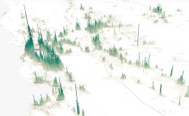
Data maps show the stark income-inequality divide in cities

Whether it’s the clothes we wear, the cars we drive or the entertainment we enjoy, the divide between rich and poor has always been tangible for Americans. Yet grasping the larger picture isn’t easy, and it’s the reason why the geospatial cloud company Esri has launched “Wealth Divides,” a new data visualization that maps income inequality in cities.
Analyzing U.S. median household income data from state and federal agencies, Esri plotted the geographic divides within San Francisco, New York, Boston, Atlanta and Washington D.C. The interactive maps go beyond simple statistics and offer insight with a stark view of economic segregation. Esri used a palette of oranges to depict lower income families with household incomes less than $100,000; and blues to illustrate higher income families with incomes of $100,000 or greater. The visual contrast is staggering, with the divisions appearing more like state borders and battle lines than city neighborhoods.
In Washington, D.C., for instance, an old economic divide remains: 16th Street NW slices the two sets of income earners apart. Lower-income residents live on the east side of D.C. and many of its outlying suburbs, while higher income residents generally live to the west. The map observes a racial divide, too. Many homes in low-income households belong to districts heavily populated with African-American residents.
In San Francisco, low-income households form themselves into a square donut. The perimeter places the wealthy in its center and around the city’s coasts and piers while lower income earners fill in the gaps. Here, the average household income in one tract is about $17,000 per year, while its neighbor — just a mile or two away — boasts a figure in excess of $160,000. The disparity, coupled with the San Francisco Bay Area’s surging real-estate prices, have led to a wave of displaced residents and a crisis in homelessness. The situation has become so dire San Francisco ranks second only to New York for the ratio of homeless to non-homeless residents, an amount that equates to roughly 800 people per 100,000 residents according to the San Francisco Homelessness Project.
In the Big Apple, the wealthy predictably cluster at Manhattan’s southern and center regions. Beyond, the city is surrounded on all sides by their less-privileged peers. The data indicates that 1-in-5 New Yorkers live in poverty, while at the same time, New York’s top 5 percent households took home more than $860,000 in 2014. In New York the homeless ratio stands at nearly 900 homeless residents per 100,000 people.
The statistics on Atlanta and Boston’s demographics are no less bleak, with Boston holding the title for the city with the highest levels of income inequality nationwide, and Atlanta taking third — just behind New Orleans.
What connects those and many other cities is an evaporating middle class. Though the unemployment rate has dropped from 10 percent during the recession to just under 5 percent this month, 9-in-10 cities saw a decline in middle class income earners between 2000 and 2014. Esri’s analysts credit this to stagnating incomes at the bottom 30 percent.
As for solutions, more affordable housing was cited as one of the best options since rent is typically the largest burden for low-income earners. Yet this answer is also a challenge due to limitations cities have on rent control, market demand and the fact there is little financial incentive to keep affordable housing. Higher real estate values translate into higher property tax revenues, and these revenues represent a dominant share of general fund money in municipalities.


