NYC debuts ‘first’ digital subway map of its kind
Officials from the Metropolitan Transportation Authority said an interactive, digital map of the New York City subway system published by the agency on Tuesday is a first of its kind for North America — and potentially the world.
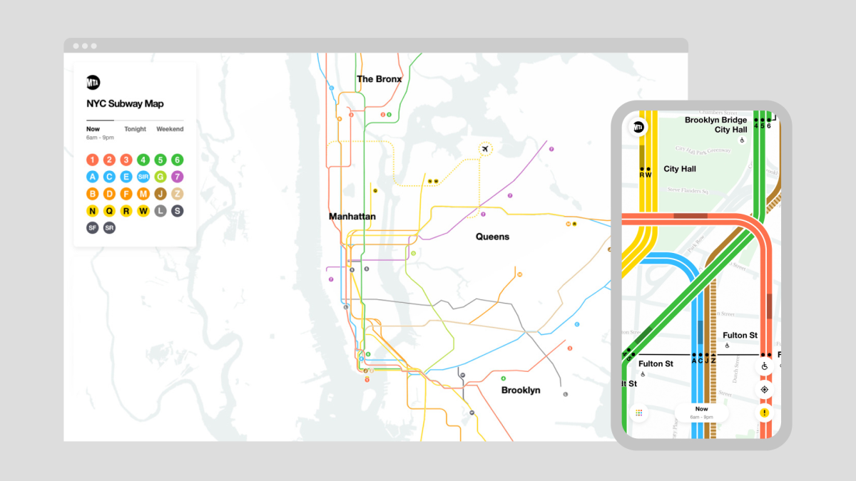
The map, available on the MTA’s website for both desktop and mobile users, streams near-real-time views of train locations, construction and delays to a virtual diagram of the train system. Users can zoom in and out on tracks to see which direction trains are heading and click on stations to check service status, as well as re-routing updates for nighttime and weekend service.
The project is a testament to upgrades in data-sharing technology, MTA deputy communications director Kevin Call said. Previously, the MTA wasn’t able to collect and share data in real-time, nor overlay single-line route maps with more detailed track diagrams.
“The technology and tools simply didn’t exist a few years ago. This is something that really wasn’t possible for smartphones and digital mapping techniques, to allow one map to sort of transform in the way that this map does to show multiple elements,” Call said.
Trains are visible moving through the map in real time. (MTA)
New York City was once home to a “Great Debate” about how to design its subway map. In 1978, an aesthetically pleasing map of the subway system was conceived by Italian Modernist Massimo Vignelli and a more topographical, clean version by Michael Hertz Associates, a New York graphic design firm. The Hertz-designed map is the one New Yorkers use today, but the technology behind Tuesday’s digital map is the MTA’s first attempt at “marrying these two concepts so they work together,” Call said.
The system is built on APIs that track the locations of different trains, and feed the data into the back-end of the digital map. But a challenge that arose during development was that there’s no such thing as train “lines” in transit data, said Joshua Gee, the director of digital customer experience for the MTA.
“There are hundreds of trains that we label “4 train,” Gee said. “Most of those trains make the same stops, but a lot of them don’t! Especially during reroutes or incidents! So we had to create an API that laid all the trips on top of each other and calculated a canonical list of stops that can define the “4 train”.
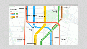
As a user zooms in, the map becomes more detailed, and straight and angled subway lines from a zoomed-out perspective gradually curve to represent more geographically accurate train routes. The curves forced Gee and his team to develop software to solve a “very, very hard mathematical problem,” he said, to draw lines that curved elegantly together. While zoomed in, users can also watch opaque gray trains move around the map as they’re moving in real life, something that will become more accurate as the project moves out its beta phase.
The digital map is more necessary than ever before because of the coronavirus pandemic, Call said, but the MTA was able to benefit from pro-bono work done by the design firm Work & Co. The map’s creation has even inspired a short film, called “The Map,” that the design firm produced with independent filmmaker Gary Hustwit.