GIS is helping state and local health agencies monitor flu, measles

Following drastic cuts to federal disease-tracking surveillance this year, and recent measles outbreaks, state and local health agencies are leaning heavily on geographic information systems to track, manage and mitigate transmission of infectious diseases.
While state and local health agencies have been relying on GIS mapping tools for many years to track the spread of infectious diseases like the flu, and more recently COVID-19, they weren’t doing so alone. The Centers for Disease Control and Prevention and the Department of Health and Human Services similarly tracked and published transmission data, which was gathered for research and public transparency. National datasets joined state and local tracking efforts to give public health professionals a more comprehensive view of transmission. They allowed localities to better understand trends so they could proactively allocate resources for disease prevention.
Under the Donald Trump administration, federal public health agencies have suffered programmatic and budgetary cuts, resulting in the loss of transmission data. This has forced state and local public health agencies to rethink how they are managing localized disease tracking to prevent even more spread.
Policies instated by Robert F. Kennedy Jr., secretary of the Department of Health and Human Services, have led to agency-wide restructuring efforts, while federal funding and staffing cuts have disrupted state and local health operations, ending immunization programs and causing staff reductions at smaller health agencies.
Another factor is an uptick in diseases once considered eradicated. The U.S. last year documented the highest number of measles cases since it was declared eliminated in 2000, including several outbreaks. Measles is highly infectious; the airborne virus can linger in the air for up to two hours after an infected person has left the area. This, said Elisabeth Long, an epidemiologist at the Washington state Department of Health, is what makes tracking so crucial.
Long said that while there have not been significant measles outbreaks in Washington this year, she said it was important for her department to prepare for outbreaks and “get ahead of the game” by thinking about prevention. In October, the department launched its Public Measles Exposure Location Tracker, a mapping tool built on the ArcGIS platform developed by Esri. It provides a overview of the places where those who were contagious with measles spent time within the last 21 days.
The map labels these locations as “active monitoring exposure locations,” each noted by an orange dot. Users can hover over dots to learn when the contagious person visited a specific location. The tool even shows which hallway, wing or floor of a building they visited. If users visited orange-dot locations during certain dates and times, they might have been exposed to measles.
Prior to adopting the location tracker, Long said, each local health department published exposure data independently, without a unified notification system. Now residents and state visitors have a one-stop shop for this information, along with information on how to prevent further transmission if one was exposed.
“The whole idea of this is so that people can quickly get the details they need, so that they can take quick action. And then that, of course, strengthens our response efforts,” Long said. “And if [users] do find they were exposed on this map, they’re able to click onto a couple different sites to show what preventative actions they could take, as well as what symptoms to look for in the meantime.”
Long said the tracker received nearly 13,000 views in the first month after its launch on Oct. 20.
“We were thrilled to see that amount,” she said. “And then I’ve checked with some of the county health departments that have used this, and they’ve given us great feedback of how it really has created it’s another avenue for them to use for reaching their residents, and also to talk about potential exposures.”
While Long said that the federal cuts to disease surveillance did not directly propel the state into creating this tool, the cuts highlighted the now elevated role states and localities play in public health disease response.
“I think [the cuts] make it all that more important to be transparent about our information, and that’s one thing we really take pride in: we want to maintain public trust. THat’s something very important,” Long said. “So yes, I think I wouldn’t say that this is something that we did in response to the sort of the shift, but it definitely augments the rest of our efforts that we’re doing here — totally.”
AI-powered prevention
In New Jersey’s Essex County, which is the seat of Newark, the local health department is also using GIS to track the spread of infectious diseases, but it’s going a step further to identify transmission hotspots, thanks to artificial intelligence.
Maya Harlow, the county’s health officer and director of the Essex County Office of Public Health Management, said managing disease prevention in a county like Essex, which is home to 800,000 residents and 22 municipalities, adds a lot of variables. She started working with the county shortly before the COVID-19 pandemic hit the U.S. in 2020, which she said was “a really big crash course.” But, it helped her to better understand exactly what was needed to mitigate the spread of infectious diseases.
And what Harlow said she needed was better data.
“For the longest amount of time, when it comes to public health, we as individuals had a really, really long, long process of looking at data. And there was flat data, right? It was in Excel sheets, it was just numbers, it wasn’t anything that we could see. So all of a sudden, we discovered — or I discovered — GIS,” she said, adding that her agency began working with a consulting company that used Esri software to better understand the spread of flu cases.
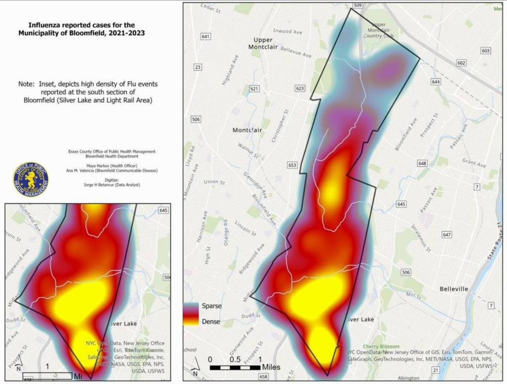
Harlow said her team looked at Bloomfield, New Jersey, a large area with both urban and non-urban areas.
“I wanted to see what a flu season and forecasting would look like just for one municipality,” she said. “A lot of the times when you’re looking at [transmission] data, there’s federal data that’s available, even county-level data that’s available. What’s not available is municipal data. And every single municipality is super different, especially in Essex County.”
Using data from the Communicable Disease Registry of the State of New Jersey, which consolidates data reported by laboratories and health care providers across the state, the team created heat maps to show where flu cases were occurring.
“Right when we started to look at these datasets, what we saw was these hot spots are located at train stations,” Harlow said. “… The people that are living [around], not necessarily using, these transit hubs are the ones that are most vulnerable to those respiratory diseases. So this is the first time that we are able to see such a picture.”
She said this health data inspired the county health department to partner with New Jersey Transit to stage “interactive interventions,” which took the form of flu clinics at their transit hubs and stations in the county. Harlow said public health officials started to use the AI tools built into Esri’s GIS platform to predict peak flu season and the ages of those most susceptible. While the seasonal peaks revealed — the winter months — were typical for the virus, Harlow said the age predictions were unexpected and enabled more targeted education and prevention.
“One of the things that we ended up seeing is that the ages that the prediction gave was ages between 25 to 30 years old, based on the data,” she said. “A lot of the time, when you’re hearing about flu and about flu immunizations, people are being 65-and-over and young children. The targeted education of the push is never to the 25-to-30-year-olds, right? But remember, the-25-to-30-year-olds are the ones that are taking care of the 65-and-over, and most younger kids.”