Commentary: The best — and worst — state legislature websites

Editor’s note: FiscalNote is a tech startup that sifts through open data on state legislation to find trends, and uses machine learning and natural language processing to predict how likely a bill is to pass. This article was adapted from an original blog post and accompanying white paper on the company’s website.
Perhaps it’s a cliche in the Internet world that government websites are poorly designed. With the controversial rollout of Heathcare.gov, the stereotype was only reinforced.
But it doesn’t have to be that way. At FiscalNote, we analyzed state legislature websites, evaluating Web speed, data accessibility and usability to determine which states were ahead of the pack and which lagged behind.
To conduct the analysis, we tapped into the knowledge of our experts — our data engineering team, which builds automated processes to scrape structured data from each site. But, because the public typically isn’t concerned with structured data, we also had our policy intern Tony Do score each site’s usability, and we ran a Web speed test on each home page. (Web speed tests are based on the first page view, with no cached content.) This gave us three scores. Here’s what we found:
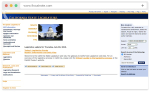
Our data engineering team loves the California site. They said it’s “easy to extract information that is very clean and consistent.” The second-fastest legislature site, it loads in less than a second. Additionally, the state recently updated its legislative information portal, marking the first redesign of the California legislative portal since at least 1997, according to the Internet Archive.
Web Speed: Good | Data: Good | Usability: Good
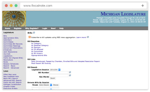
Michigan
One of the most lightweight and fast-loading sites, Michigan gets a rating boost for efficiency. The site attempts to be mobile friendly, but some tables extend beyond the screen and leave content hidden. Still, our tester found the site to be user friendly, noting “it has a feature that shows the bills of Michigan on a graph and describes the keywords related to the content.”
Web Speed: Good | Data: Average | Usability: Average
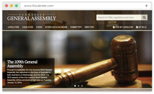
Tennessee
The General Assembly has one of few legislative websites that we would call “well designed.” Despite displaying some large images, it manages to keep page weight in control – at just over 1 megabyte — and page speeds are in the middle of the pack. As a recently designed site, it features several best practices. It uses Modernizer.js and responsive design to adapt to user devices; and it uses Google Analytics to track behavior.
Web Speed: Average | Data: Average | Usability: Good
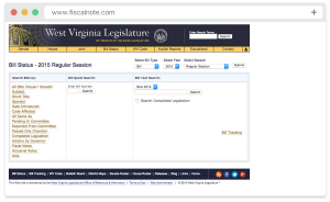
This Legislature’s website has the fastest page load of any we evaluated, fully rendering in less than a second. That’s not surprising for a page that only weighs 126 KB, also making it the lightest state legislature page. Additionally, it uses Google Analytics and Google Webmaster Tools to understand user behavior, which is considered a necessity in most industries but, given the absence of these tools on most legislature sites, earns respect. “The search options are user friendly and organized well. However, the results that show up after using those search options are somewhat confusing. The results would sometimes include odd characters and are presented in a messy, un-orderly fashion,” our tester said.
Web Speed: Good | Data: Average | Usability: Good
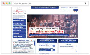
The data team said Virginia’s legislative site is an “example of a better-than-average, easy-to parse site for a scraper.” They noted it has a section that lists all bills by session, and that votes and actions lists follow similar formats. It’s also one of the faster loading pages, displaying in less than 2 seconds. From the user tester perspective, this website is very organized because, according to our user, it “categorized its search options, which ultimately allowed for the whole bill search process to be quick and simple.”
Web Speed: Good | Data: Good | Usability: Good
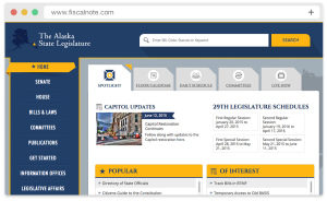
Alaska: The Alaska Legislature easily has the best-designed site of any legislature. But in doing so, it becomes one of the heaviest sites. The site weighs over 3 MB and takes nearly 8 seconds to load. Also, it has more than twice the file requests of any other legislature, with 211. (File requests are individual calls to the server, and too many slows down the time it takes a page to render.)
Hawaii: Hawaii’s site is a favorite of John Zoshak, FiscalNote’s senior policy manager. It’s fairly well designed, but it’s not mobile friendly.
We just gave the Alaska Legislature an honorable mention for its attention to design, but the site just loads so slowly. The user tester noted that “the wide array of options was great. However, it became extremely excessive when you have an idea of which kind of bill you are searching for, but still must pass through many different pages.”
Web Speed: Bad | Data: Average | Usability: Average
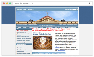
Neither our data team nor our user tester is excited about Arizona’s site. Noting that the data is already poorly structured, the data team added that “when searching for data further back, the formatting gets worse somehow.” Our user tester said the site is “particularly confusing and cumbersome to navigate. For bill indices, there are too many options to select from, the information is not portrayed in a convenient manner.”
Web Speed: Average | Data: Bad | Usability: Bad
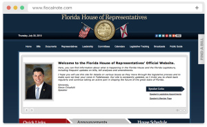
States with separate websites for the House and Senate immediately get a demotion. While the Senate website had some good notes from user testing, the House site doesn’t perform well: Our tester “used a few search key terms and the website provided irrelevant results.” Additionally, both sites have slow performance, taking more than 4 seconds to visibly render — the House website takes more than 6 seconds to fully load. Neither site is responsive, but the Senate version redirects to a mobile version, which is not a best practice.
Web Speed: Bad | Data: Average | Usability: Bad
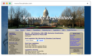
Our data team ran into a few issues with the Kentucky Legislature site: “It’s relatively easy to parse the bills, but obtaining the votes is a nightmare,” they said. Using the site was frustrating for our tester, who said “there are too many options to click through, with new pages, before actually reaching a bill. The layout of the bill numbers is way too messy for readers to navigate through.”
Web Speed: Average | Data: Bad | Usability: Bad
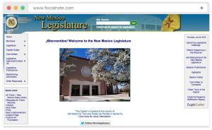
The data team doesn’t pull any punches with New Mexico’s website. One member said, “On my most hated list. [New Mexico] has their own way of doing action mappings. After multiple iterations I think we finally got it to work but they abbreviate all actions and have a very esoteric format.” Usability testing found it easy to navigate. While the site loads in less than 4 seconds, we couldn’t ignore the data issues.
Web Speed: Average | Data: Bad | Usability: Good
Connecticut: Weighing more than 6 MB, this site takes more than 11 seconds to fully load. As the heaviest and slowest legislature website, it deserves a bottom-tier spot, but our user testing found the website’s tools “helpful” and “comprehensive.”
Oregon: This website weighs over 3 MB, putting it in the top three of the heaviest legislature sites. With 77 file requests, it is also one of the three slowest, taking 8 seconds to load. Our data team noted that the underlying JavaScript code makes the site a bit difficult to scrape; but our user testing found it simple to navigate, which saved the site from appearing on the “worst” list.
Adam Nekola is a Web developer at FiscalNote and formerly the Pew Research Center.
