The underappreciated art of state government 404 webpages

One of the most important digital services a state government can provide is a website that’s resourceful and easy to use. But no matter how well constructed a website is, as files get moved and updated, there’s always the possibility a user will land on a missing page and get a “404 Not Found” error.
Because a web browser’s default 404 error can be jarring or confusing for users, it’s become common practice for user-conscious organizations to create a custom error page that provides instructions on what to do next. The internet’s metaphorical dead end also provides an opportunity for web designers to show off their creativity.
But 404 pages are not only an opportunity to express originality — they are also a necessary facet of website design. Kirsten Wyatt, senior director of the Digital Service Network at the Beeck Center for Social Impact and Innovation at Georgetown University, told StateScoop that 404 pages are crucial for accessibility.
“Well-designed 404 pages successfully guide users out of a dead end and to their desired location on a website, which results in a less frustrating and time consuming online experience,” Wyatt told StateScoop in an email. “Key elements to a well designed 404 page include plain language, calls to action to engage with a search field or popular links, and a reassuring look and feel consistent with the organization’s theme. It is also important to conduct regular user experience audits to find and address broken links – this will decrease the chance of a user reaching a 404 in the first place.”
StateScoop looked at every state’s 404 webpage to find those that highlighted the importance of original design and accessibility on the web.
Delaware
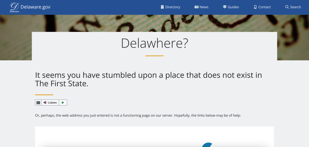
At first glance, Delaware’s 404 page appears to be nothing special. But then it hits you… Delawhere? We’d be disappointed if the state had not leaned into this brilliant pun, which was quite literally made for a 404 page. We also deeply admire their ability to not-so-humbly insert that they were the first state into the page as well. This page also offers links below to help the user find what they’re looking for.
Arkansas
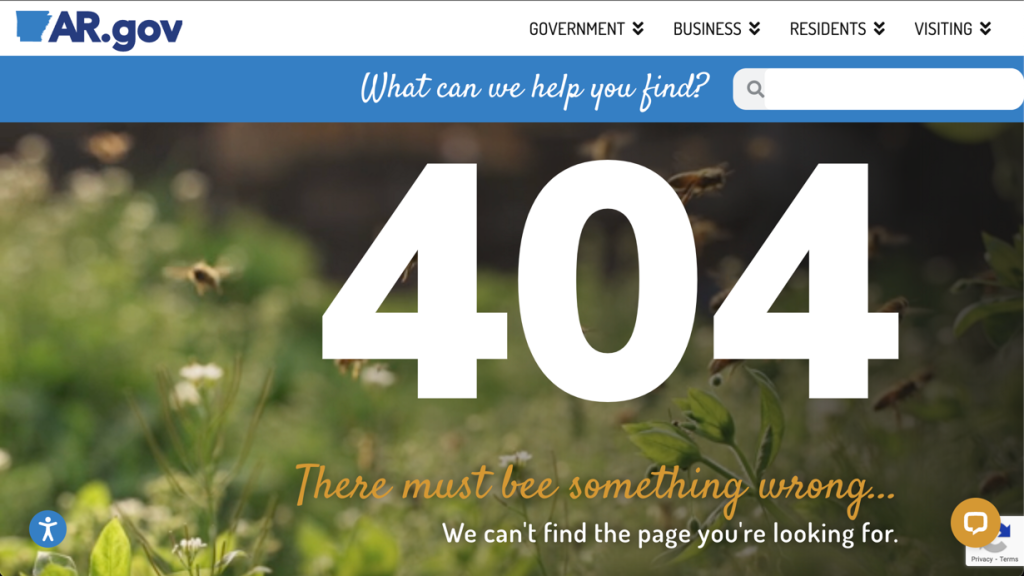
This 404 page, which lets you know ‘There must bee something wrong,’ makes getting lost on Arkansas’ website a pleasant experience. Bee-tween the bees — which is the official state insect of Arkansas — the punniness and the approachable font, this 404 page has it all. The user can also appreciate the large font used for the 404, which ensures they know exactly where they’ve wound up.
Alaska
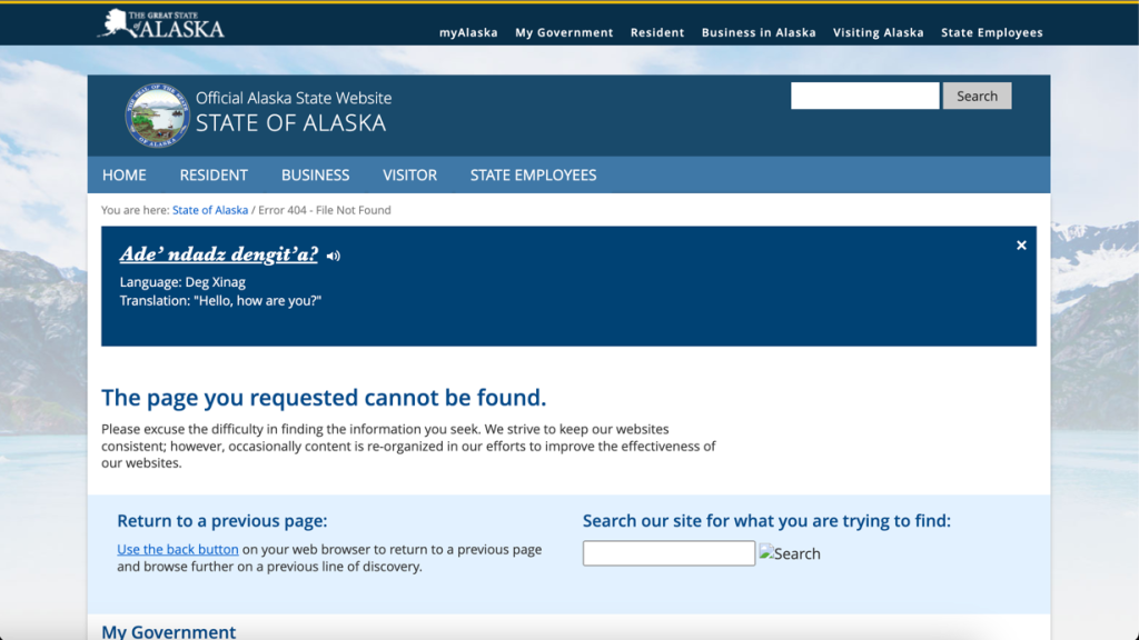
Alaska’s 404 page is not unique from the rest of its website in the way that other states’ 404 pages are — no fun artwork to make it a noteworthy, standalone page. However, it does add a bit of charm with the polite, albeit lengthy phrasing: “Please excuse the difficulty in finding the information you seek. We strive to keep our websites consistent; however, occasionally content is re-organized in our efforts to improve the effectiveness of our websites.”
Hawaii
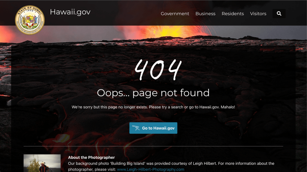
Following a broken link on Hawaii’s state website ends in lava, an apt motif for the Aloha State. The aesthetically pleasing backdrop image, paired with an “Oops” and a congenial “Mahalo,” encourages the user to keep searching on Hawaii’s website. In addition to a link back to the website’s main homepage, there’s also some information about the image’s photographer.
Iowa
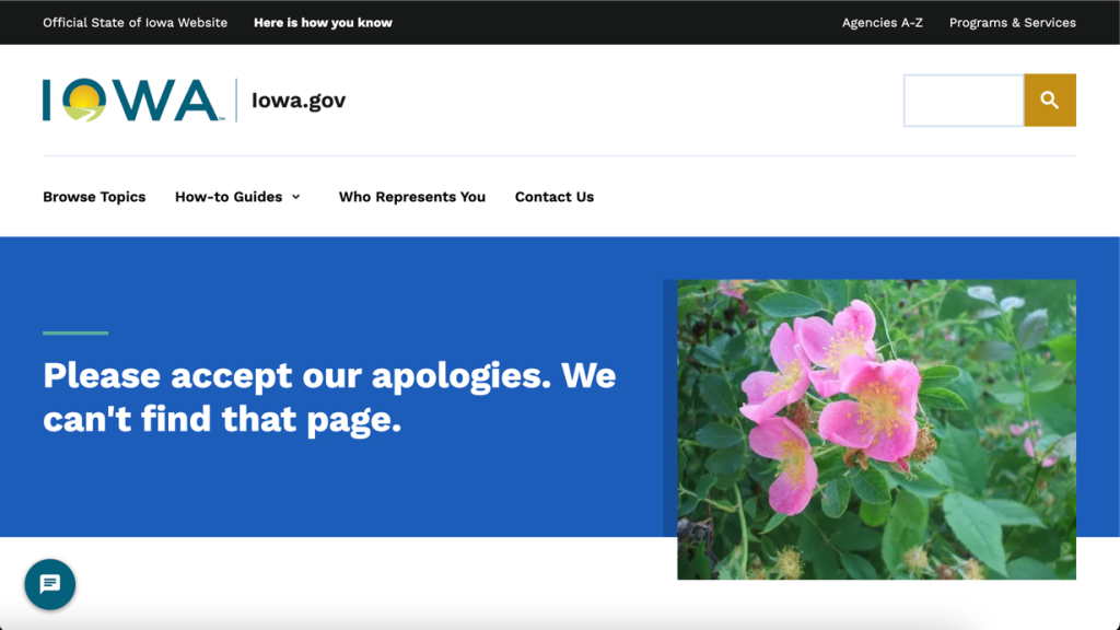
Iowa’s 404 error page epitomizes Midwestern politeness and even offers the user flowers for the inconvenience of hitting a dead end. The page doesn’t go for any gimmicks or puns like those used in some states, but maybe the flowers could provide a calming effect on irritated users.
Wisconsin
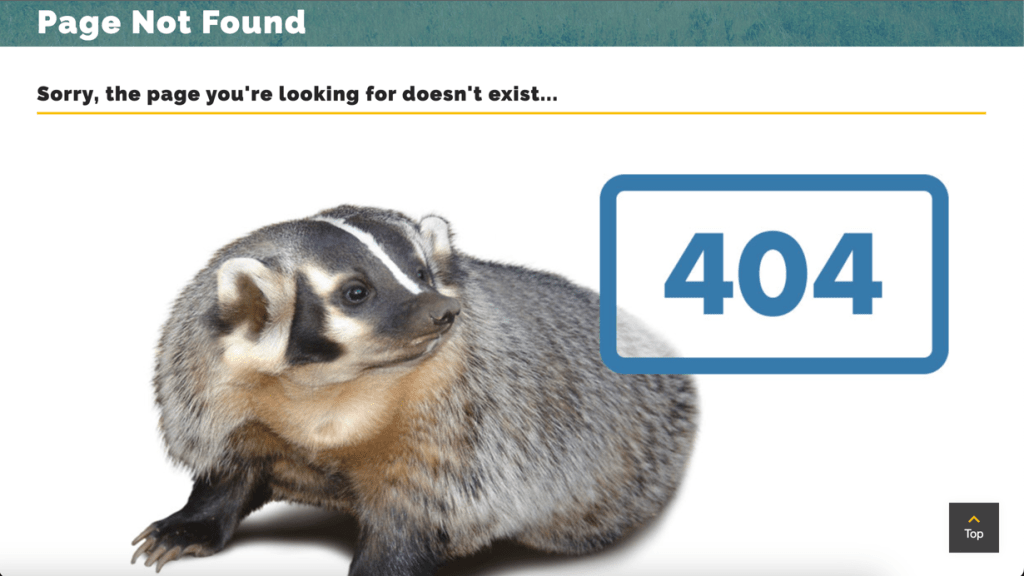
While finding a badger at a real dead end might not be the most pleasant experience, finding one on the 404 error page of Wisconsin’s website is a nice surprise. Dubbed the Badger State, Wisconsin uses the American badger as its emblem and mascot for many of its sports teams. The animal lends panache to the simple, original design.
Texas
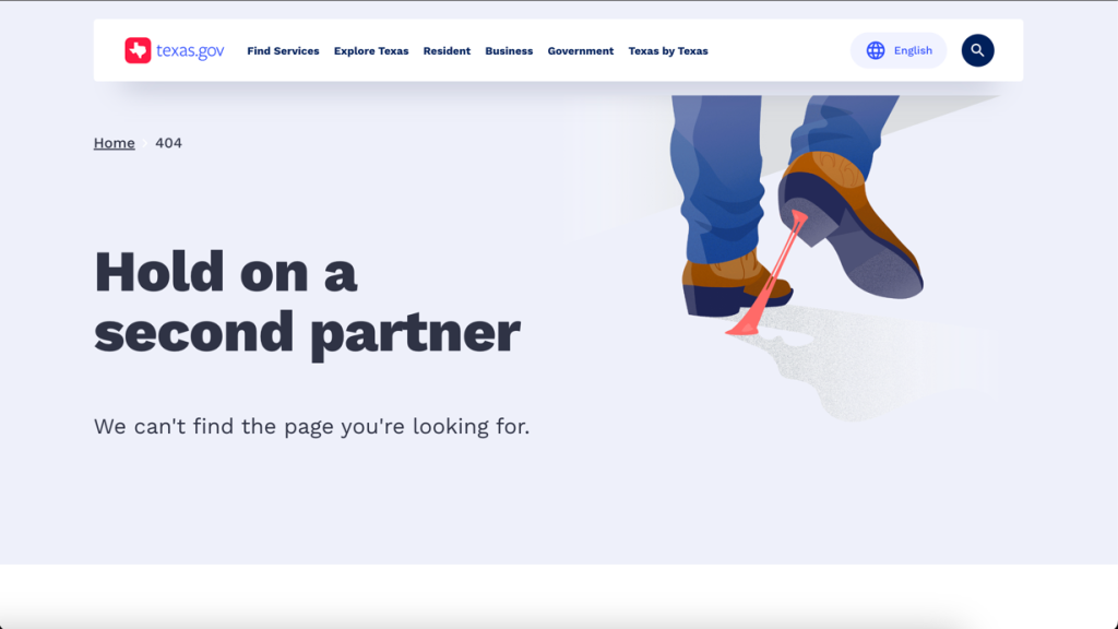
Nothing is more quintessentially Texas than a pair of cowboy boots, and the state made sure that its 404 error page exemplified the Lone Star State’s ten-gallon reputation. A simple and clean aesthetic, paired with the use of the word “partner,” can make even a lost website user feel at home.
Nebraska
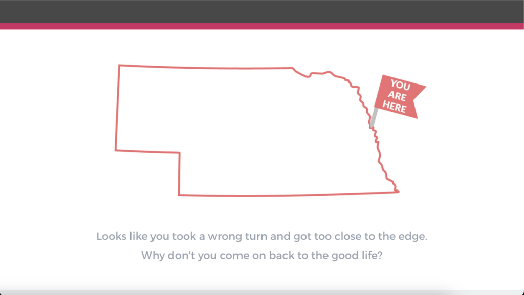
Nebraska makes use of its simple 404 error page to show you exactly where you’ve ended up on the state map, which is outside of the state’s eastern border, which is carved out by the Missouri River … which means you’ve ended up in the water. Hope you packed a life jacket!
Utah
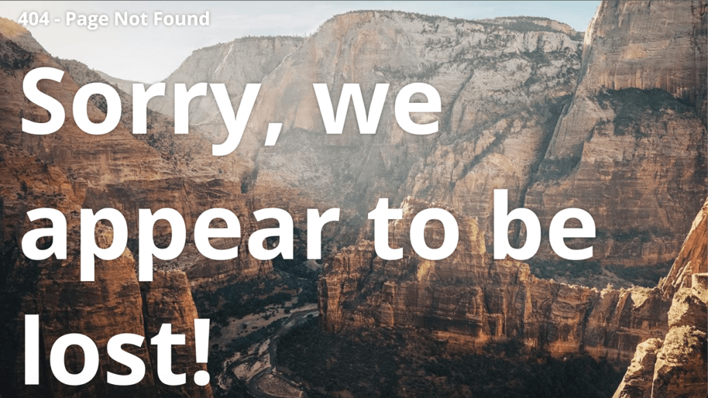
Sleek, modern and direct, Utah’s 404 error page feels like a master class in design for function. Below the word “lost” is a link back to the site’s homepage. Also of note is the webpage’s use of “the royal we” to let users know that they’re not alone or forgotten.
Washington
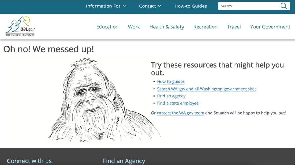
Out of all the states’ 404 error pages, Washington’s is the only one that features an illustration of a mythological being. The addition of Bigfoot — whose legend has spawned continued reports of sightings all over the country, but particularly in the Pacific Northwest — delivers a whimsical element to go with helpful resource links. The state even takes accountability by confessing: “We messed up!”

This story was featured in StateScoop Special Report: Digital Services — A StateScoop Special Report


