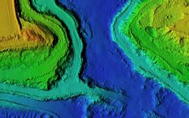

Virtual Singapore
Singapore
Many maps attempt to represent a city, but few can match the intricate modeling and artful nuance of Virtual Singapore. It is arguably the world’s most accurate digital reconstruction of a citys landscape and data a real-life Sim City that combinesthe island nations exact infrastructure specs, building utility consumption levels, traffic patterns, parking capacity, health data andemergency services information. The platformis even detailed enough to show the building materials used and architectural details of every building in the city. Yet Virtual Singapores greatest value might be found in its ability to help city planners, engineers and emergency workers simulate how the they might respond to natural disasters, population growth, traffic density, and any number of other challenges that affect cities. In beta at present,the map has been under development bythe French software company Dassault Systmessince 2015 with Singapores National Research Foundation. The city hopes to launch a full version forstaff by the end of 2017, with future iterations to come.

IndianaMap
State of Indiana
IndianaMap is a buffet of geographic information fed by more than 260 GIS data sets. These can map basic demographics like age and race or dive into topics like agribusiness, aquifers, coal deposits or critical infrastructure. The purpose is to provide a public platform that residents, researchers, journalists, academics and businesses can use to make better decisions. Created and maintained by the Indiana Geological Survey, IndianaMap is notable for being the largest publicly available collection of state GIS data out there.

Stress Map
Philadelphia
In an effort to use school facilities to confront neighborhood problems affecting children, the City of Philadelphia designed the Philadelphia Stress Map to map its pain points. Issues like obesity, poverty, drugs and diabetes are all plotted as are the locations of school sites that might be used as intervention centers and resource hubs. City developers pulled in data from the U.S. Census Bureau, the Philadelphia Police Department, schools and the Center for Disease Control to generate heat maps for each issue. The long-term goal for the city is to gain insights that can be used when making community investments.

Predictive Crash Map
State of Indiana
Indiana residents dont have wonder anymore where theyre most likely to crash their vehicles. In 2016 the Indiana State Police (ISP) and the Management Performance Hub (MPH), a state data and transparency office, launched the Daily Crash Prediction Map to identify dangerous areas where drivers should be more alert. The map applies historical crash data to rate crash risks. Visitors can zoom in to see where past collisions have been reported. The map also adds a color-coded layer to indicate the probability of crashes within 1 square kilometer and by three-hour time periods. Blue shading indicates low probability, yellow a moderate chance and red notes the highest probability for a wreck in a given area. Key takeaways from the map include a prediction that the highest chance for a collision is between 3 p.m. and 6 p.m. in the center of the state’s urban areas.

Analyzing Traffic Accidents in Space & Time
State of Florida
Taking a different angle on traffic collision maps, Brevard County, Florida, has compiled a series of maps and data called Analyzing Traffic Accidents in Space and Time that can plot emerging crash trends as well as note the more common danger zones. Using Esris story map tools, Brevard County GIS Analyst Lixin Huang analyzed every motor vehicle traffic accident in the county between 2010 and 2015. The result is a map that chronicles where there are new hot spots, consecutive hotspots and sporadic hotspots for crashes. The analysis includes an investigation a creative set of segmented columns that are shaded based on the frequency of crashes. The maps also shed light on questions like, which intersections and roadways have the highest crash rates? When and where do most crashes occur? And how do the patterns of fatality locations differ from the patterns of accidents? While traffic analysis is a common focus area for GIS practitioners, this story map earns points for its level of detail and narrative context that make the issue understandable and meaningful.

Washington / Baltimore Opioid Overdose Map
Washington, D.C. / Baltimore, Md.
This map might not be available to the public, but there is little doubt of its public benefit. The Washington/Baltimore Opioid Overdose Map (ODMAP) is an app used to fight the more than 52,000 overdose deaths each year across the country. Currently deployed in Washington, D.C., Maryland, Virginia and West Virginia, the app functions as a monitoring device that first responders can use to report and track fatal and non-fatal overdoses.Its most valuable feature is an alert system that notifies law enforcement and healthcare providers of local overdose spikes within 24 hours. This enables first responders like police to develop response strategiesfor specific areas.


