3 ways GIS is improving service delivery for California HHS

Public sector organizations are increasingly utilizing geographic information systems, or GIS, mapping capabilities to gain greater operational efficiencies and improve the delivery of their programs and services. We too are embarking on this journey at the California Health and Human Services Agency (CHHS) by increasing the utilization of GIS and by building the skillset among our workforce to further deploy the use of GIS within our business processes.
Over the past few years, we at CHHS have made significant investments to develop a culture of innovation, while also transforming into a more client-centered, data-driven agency. Collecting and sharing data is the first step — aggregating and analyzing data in a way that helps illustrate the problem or define the solution is the second step. We now have an opportunity with GIS to not only improve how we deliver our services, but also how we interact with our clients and inform the public.
We have large amounts of data, and how we use it can be extremely powerful. Leveraging tools such as GIS mapping gives us the opportunity to present our data in a digestible format to help us track our progress in real time, and it gives us the ability to prioritize our work and refine our goals and objectives. Most importantly, it gives us the capability to succinctly communicate with the public and our stakeholders.
Here are three examples of how we are utilizing GIS mapping capabilities to further leverage our data to improve our operations and the delivery of our programs and services.
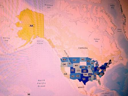
CalFresh utilization
We developed the CalFresh Dashboard not only to help us better understand our clients’ characteristics, but also to help inform our partners in their work. This tool not only aggregates the data, but it also helps us understand trends in CalFresh demographics, participation rates, benefit accuracy and churn rates.
We are now exploring ways to expand this tool to incorporate other programs to provide a more comprehensive snapshot of the utilization of health and human services programs. It can help us explore cross-program utilization by individual persons and families, help us better serve clients in multiple programs, improve how we deliver programs, create efficiencies, and help us evaluate our work to ensure we are meeting our goals and objectives.
Data integration
As part of our broader innovation work, we established a Use Case Team to explore ways in which we can further share data between the CalFresh program and the Women, Infants and Children (WIC) program to increase utilization. These programs have a mutual interest in connecting children and families to food. Many families that qualify for WIC, a nutrition program that helps mothers and children ages zero to five secure healthy food, also qualify for CalFresh, and vice versa. However, the two programs had previously been unable to compare enrollment data.
We created a data-sharing agreement across three departments, completed necessary data matches, developed supporting analyses, and created GIS maps to engage with counties for the deployment of programmatic interventions that support improved enrollment. GIS maps were an integral resource to create these linkages and ultimately a more comprehensive view of our customers and their benefit needs.
Wildfire response
Our response to the recent wildfires was another opportunity for us to utilize data and GIS mapping capabilities to assess the scope and identify the short-term and long-term needs of the impacted communities. We had a significant amount of data on the facilities impacted that are licensed or certified by our departments. Our challenge was pulling all the data together quickly and in a digestible format.
As we responded to the Northern California fires in October, it took us nearly two weeks to compile the data in a format that could inform and prioritize our response efforts. This meant that we had to send staff into the region to put eyes on the facilities that we were not able to contact. This was not the case in December as we responded to the Southern California fires. Within 48 hours, were able to assemble and visualize the data, so that we could assess the impact of the fires.
GIS is one component of our broader strategy to improve the culture of innovation within our agency.